06-EarthenWeb business card (front and back)
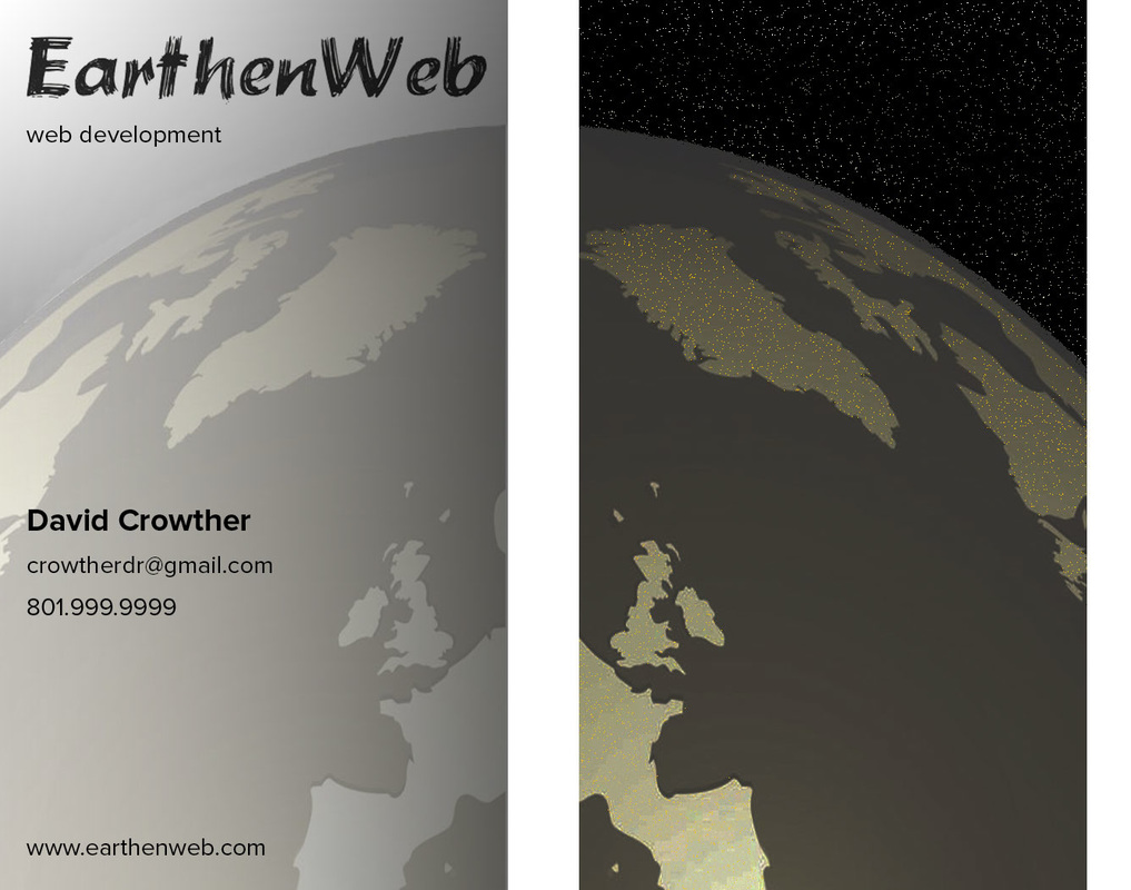
Inspiration for this business card came easy. I did some work with someone to prototype a web site and I needed a business name with a web site to collect my fees electronically. "EarthenWeb" is the name I chose. I was going for something that sounds Earth friendly and with a professional touch.
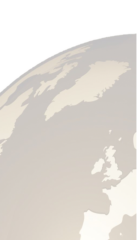
Next I created a web site, www.earthenweb.com, which is really just a single web page to provide a web presence. For the logo I used a font (Brushstroke Plain) that to me is natural looking like plant fibers. Then I found some clip art of the Earth and applied at least one filter; something like sepia.
Next I created a web site, www.earthenweb.com, which is really just a single web page to provide a web presence. For the logo I used a font (Brushstroke Plain) that to me is natural looking like plant fibers. Then I found some clip art of the Earth and applied at least one filter; something like sepia.
Preparation:
Features
Credits:
- Created two artboards for the front of the card and a possible back.
- Made a square 2" x 2" for a guide for the logo and the contact information.
- Captured the EarthenWeb logo from my web site and removed the background. Then I placed it on the top of my portrait business card. It is left justified, but fills the header of the card.
- Captured the Earth background from my web site and transformed it so that it filled most of the card. I duplicated that layer and flipped it horizontally to put it on the back of the card.
Features
- The text, except for the header, uses Proxima Nova. The tagline is 7pt, my name is bold and 9pt, and the contact information and URL are 7pt.
- I like the left alignment. The contact information is under the guide square. The URL is at the same distance from the bottom edge as the logo is from the top edge.
- There are two gradient layers/masks. Both are from white to black. One goes left to right and makes the front 'daytime' look blend into the back side 'nighttime' look.
- The other provides a light to dark glow in the 'sky' which I think gives a metallic look in the sky and blends well with the sepia look of the Earth.
- The back of the card is meant to look like nighttime.
- I added a black disolve mask to the sky and set the opacity to 99% so that it would make it look like a starfield.
- I added a brightness|contrast adjustment to the entire back side to darken everything so it would look like night.
- I added a layer with just the land areas selected, filled them with yellow and then set the disolve to 2% opacity so that it would look like city lights on the continents.
- I am still debating about finding a look of the Earth from the other side so that the image on the back side is not just a duplicate of the front side.
Credits:
- Fonts used: Brushstroke Plain and Proxima Nova.
- Brushstroke Plain was licensed from fontsquirrel.com.
- I don't remembered where I got the Earth logo from, but I remember licensing it.
Original images