04-No Place Like Home
My family recently moved to a new home the year that I create this exhibit. We had only been in the home for a few months and had become quite comfortable. I really like the backyard so that was my pick for this exhibit.
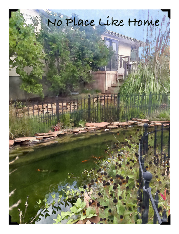
I watched a video about how to turn photos into pencil drawings. I planned to do this with this photo and then color it. I wanted the coloring to look like it was done with crayons, chalk, or colored pencils. I struggled to find the right brushes and using a trackpad was not anything like using real crayons and paper. While trying to find something that would work, I found a video from the same author of the pencil drawing that shows how to change a photo into a water color image. That was the look I wanted.
I watched a video about how to turn photos into pencil drawings. I planned to do this with this photo and then color it. I wanted the coloring to look like it was done with crayons, chalk, or colored pencils. I struggled to find the right brushes and using a trackpad was not anything like using real crayons and paper. While trying to find something that would work, I found a video from the same author of the pencil drawing that shows how to change a photo into a water color image. That was the look I wanted.
Preparation:
Margin and layout:
Text features:
Composition includes the following image and its adjustments:
Accomplishments:
Credits:
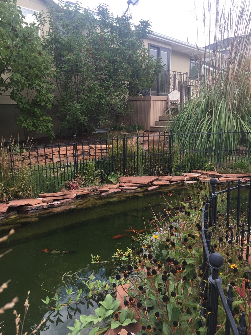
- I took 68 photos in my backyard from different angles. I really wanted the pond included so most had it in them.
- I took 4 set of photos that could have been used as panoramas. The panoramas were too big for the look I wanted.
- The only text I wanted was "No Place Like Home" and I wanted it in a light, comfortable font that would be as welcoming as I think the backyard and the title are.
Margin and layout:
- I used the crop tool to add a white margin around the photo.
- I found a tutorial on how to make photo mounts (http://www.photoshopessentials.com/photo-effects/photo-mounts/) and I added those.
Text features:
- "No Place Like Home" uses the Bradley Hand font and is 48pt.
Composition includes the following image and its adjustments:
- Photo from my backyard towards the back of the house.
- Through the steps for making the photo have a watercolor look the top right resulted in a faded look which worked out for a place for the text.
- I used a color from the pond for the text color.
- Before I did the watercoloring steps I edited the photo to remove the part of the neighboring house that was showing. I used a combination of the quick selection tool, the magic wand with "Select similar", and then hand painting.
- I also darkened the wood bench on the deck so it wouldn't demand too much attention.
- The steps for watercoloring the photo are:
- Lighten the midtones because the photo was a bit dark.
- Copy the original layer and apply a smart blur to it.
- Make another copy of the original layer and apply the "Glowing Edges" Stylize filter. Then invert the image and remove the color (Cmd+Shift+U). Then change the blend mode to Multiply.
- Make a copy of the smart blur layer. Invert that layer and change its blend mode to Color Dodge. With the foreground black and background white paint over the photo with the dry brush and then the watercolor textured surface.
- Lighten some pencil lines.
- Then darken some of the the brush areas by making a composite snapshot of the brush layer (Cmd+Shift+Option+E) and then adjust the levels.
- Finally, select the Texturizer from the Filter Gallery and select the "Sandstone" texture.
- I added an "angled strokes" filter.
Accomplishments:
- I practiced with many of the Camera Raw adjustments and Photoshop adjustments that we have learned so far. The final exhibit did not require adjustments or the panaroma tool in Camera Raw, but I practiced those as I was trying to find the right photo and the right look.
- I practiced with the selection tools, crop tool, and brushes, including the shortcuts for adjusting the brush settings.
- I implemented the idea of a color pallete by using a color from the pond as the text color and the color of the sky from another photo that had blue sky showing.
- Overall, I am much more familiar with the Photoshop user interface.
- I used contrast to make the pond, landscape, and house stand apart from each other.
- "No Place Like Home" is in a font that I think is welcoming (like home) and it is placed on the home. I tried to make sure that it has enough contrast to stand out and I like the placement with plenty of top and right margin.
Credits:
- Font used: Bradley Hand
- Changing a photo into a watercolor image: https://www.youtube.com/watch?v=VRs6enx9DDE
- Making photo mounts: http://www.photoshopessentials.com/photo-effects/photo-mounts/
Original photo