05-Mow Your Lawn Flyer
The weekend I did this I was out mowing the lawn. The weather was very pleasant and made it nice for mowing (I don't particularly like mowing the lawn). We were heading into the colder seasons we are cutting the lawn shorter and the lawn was really looking nice. That's where this idea came from.
Preparation:
Features:
Credits:
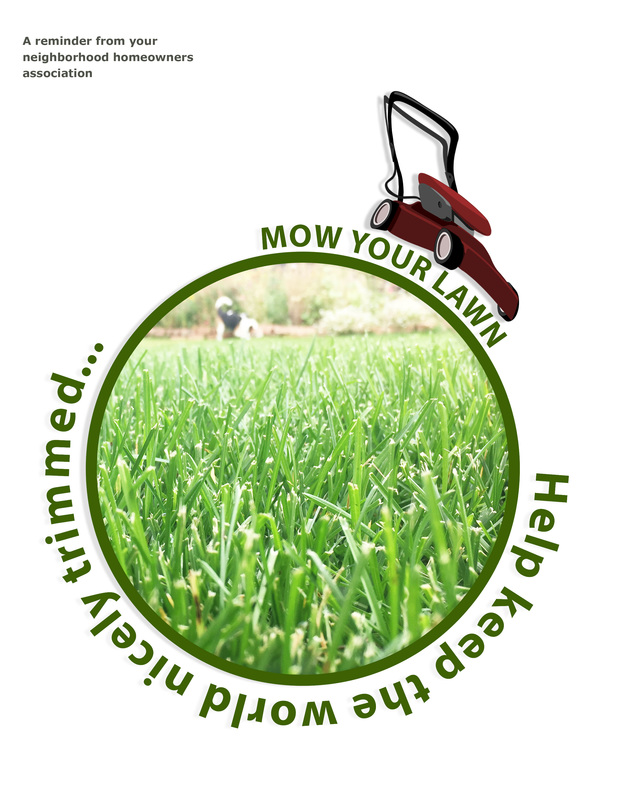
- I wanted the design to be simple with very few colors. Green would need to be one of the colors since I would be focusing on mowing grass.
- I originally thought of having a image of the Earth in green, but then realized that it would be enough to have a green circle. I think that viewers would get the idea.
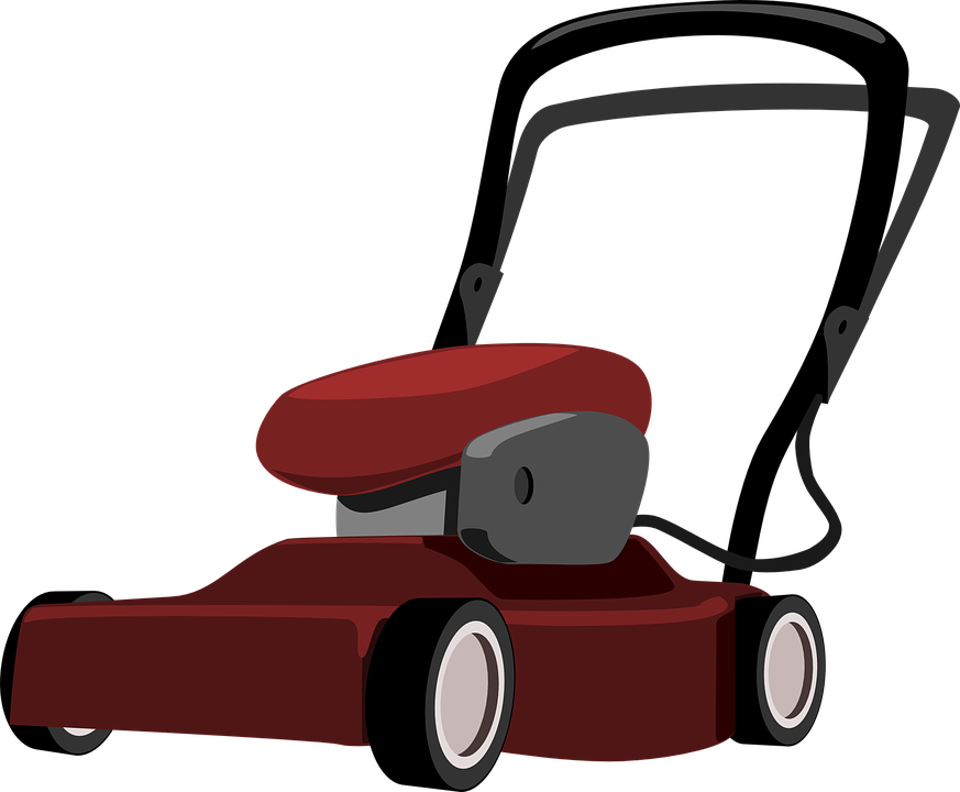
- I wanted a simple animated lawnmower image.
- For a person, I didn't want an image of a person to distract from the flyer itself so I decided to have "Mow your lawn" be in the shape of a person pushing the mower.
Features:
- I used the shape tool to draw a circle with a brighter green (00a651)
- Then I used the circle as a path for the text "Help keep the world nicely trimmed..." which is Myriad Pro bold 48pt (32 pt for "Mow Your Lawn) font color 253c02.
- The red of the lawnmower contrasts nicely with the green of the text and circle without looking like Christmas colors.
- I think that the circle with everything following its path provides a sort of repetition because, when I look at the flyer, I feel like I keep going around and around the message.
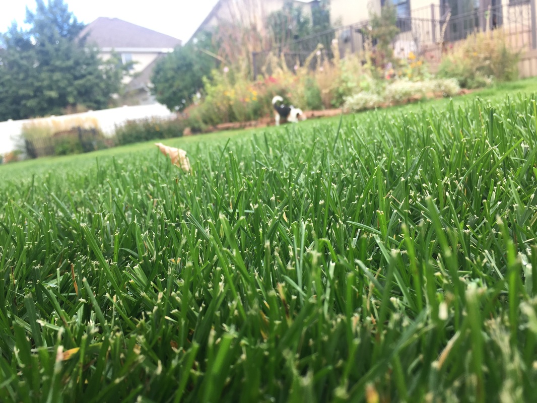
- Added a photo of a nicely trimmed lawn to the circle.
- The alignment of most everything is to the circle with the same distance from the circle. The flyer sponser is tucked nicely in the upper left of the flyer. It's out of the way, but still there.
- The mowing and the message is in close proximity to the circle. Keeping the world nicely trimmed by mowing your lawn is the focus of the message.
- Positioned the mower over the "Mow Your Lawn" text.
- With that much done I thought the flyer was done except that it is a contrived example and I thought it need to be associated with some cause or organization. It reminded me of something a homeowners association might do so I added the text regarding the homeowners association. It is written in Verdana bold at 11pt. I like this text, but I don't think it needs to be very noticeable.
Credits:
- Font used: Myriad Pro bold 48pt (32 pt for "Mow Your Lawn) and Verdana Bold
- lawnmower image: https://pixabay.com/static/uploads/photo/2013/07/13/01/10/lawnmower-155231_960_720.png from (https://pixabay.com/p-155231/?no_redirect: found with a Google image search with filter for "labeled for commercial reuse with modification"--https://www.google.com/search?q=lawn+mower&safe=strict&source=lnms&tbm=isch&sa=X&ved=0ahUKEwiOp-vv6czPAhWa3oMKHaMJAlwQ_AUICSgC&biw=1916&bih=960#q=animated+lawn+mower+pictures&safe=strict&tbs=rimg:CRPKCok7c6d0IjhyZjSIzB8eAlQdjs4s-UNgWTOurhXiO0RcOWzRhrW2y4tN5a3UOtGhYOPzJO91PyK2iSJp2o1p_1ioSCXJmNIjMHx4CEZD7aezhKt3qKhIJVB2Oziz5Q2AR14Y1R9g4-U0qEglZM66uFeI7RBEd_1rq-MUrefSoSCVw5bNGGtbbLEY8mLHF6koVRKhIJi03lrdQ60aER4dZJUtbXb1QqEglg4_1Mk73U_1IhEZivRPYztZ7yoSCbaJImnajWn-EbS394jx9JIb,sur:fm&tbm=isch&imgrc=E8oKiTtzp3SERM%3A)
- person pushing mower used as a guide for the text person: https://westtorontoservicesforseniors.files.wordpress.com/2015/07/mow.jpg (https://wtss.org/2015/07/30/looking-for-home-maintenance-help/: found with a Google image search with filter for "labeled for commercial reuse with modification"--https://www.google.com/search?q=lawn+mower&safe=strict&source=lnms&tbm=isch&sa=X&ved=0ahUKEwiOp-vv6czPAhWa3oMKHaMJAlwQ_AUICSgC&biw=1916&bih=960#q=animated+lawn+mower+pictures&safe=strict&tbs=rimg:CRPKCok7c6d0IjhyZjSIzB8eAlQdjs4s-UNgWTOurhXiO0RcOWzRhrW2y4tN5a3UOtGhYOPzJO91PyK2iSJp2o1p_1ioSCXJmNIjMHx4CEZD7aezhKt3qKhIJVB2Oziz5Q2AR14Y1R9g4-U0qEglZM66uFeI7RBEd_1rq-MUrefSoSCVw5bNGGtbbLEY8mLHF6koVRKhIJi03lrdQ60aER4dZJUtbXb1QqEglg4_1Mk73U_1IhEZivRPYztZ7yoSCbaJImnajWn-EbS394jx9JIb,sur:fm&tbm=isch&imgrc=_)
Original images